Maqam Type
SampleContemporary Arabic type, drawn for the screen.
Capabilities
- Type design — Arabic and Latin companions
- Variable fonts — weight and width axes
- Interface testing — real UI density, not specimen sheets
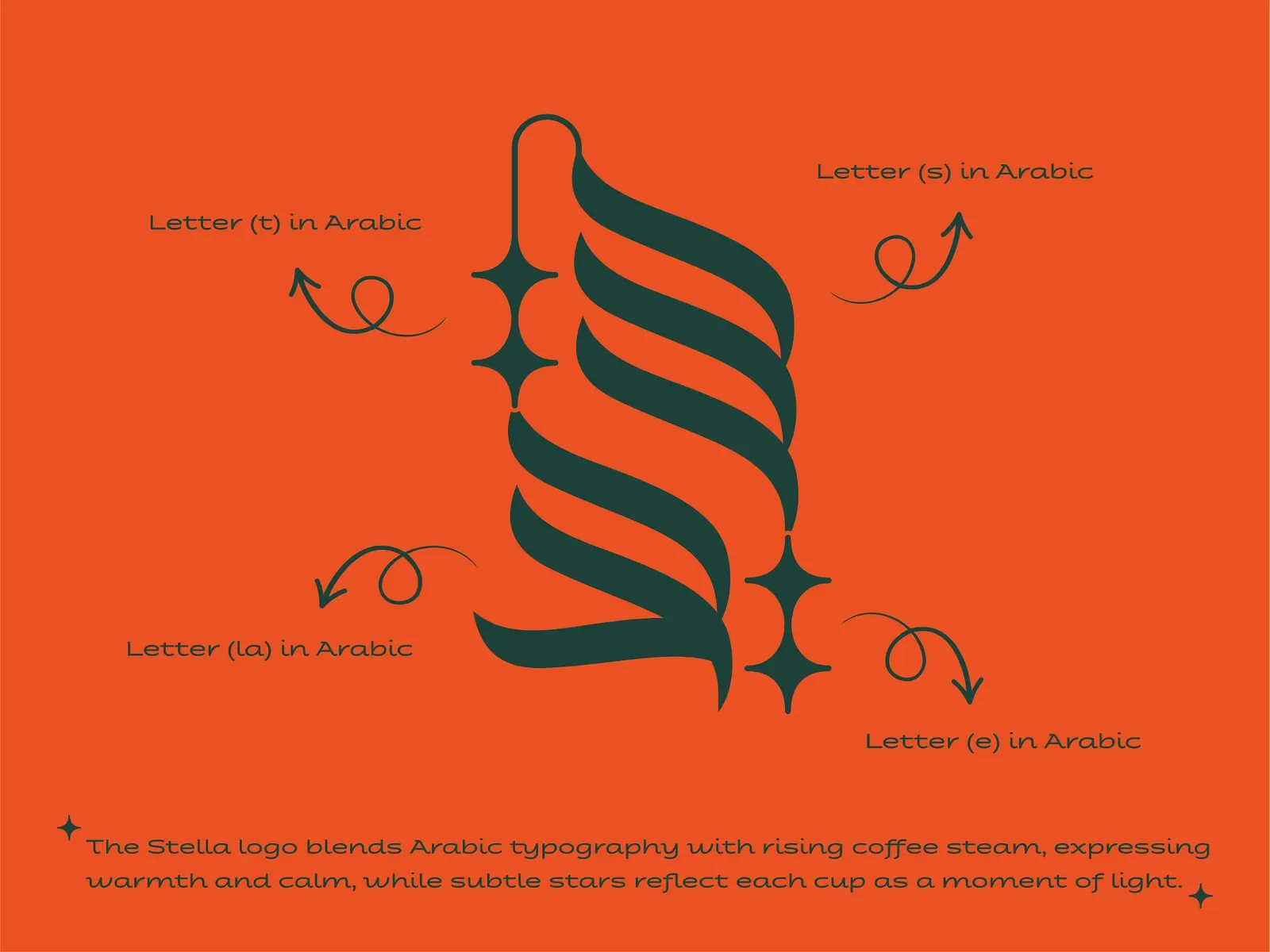
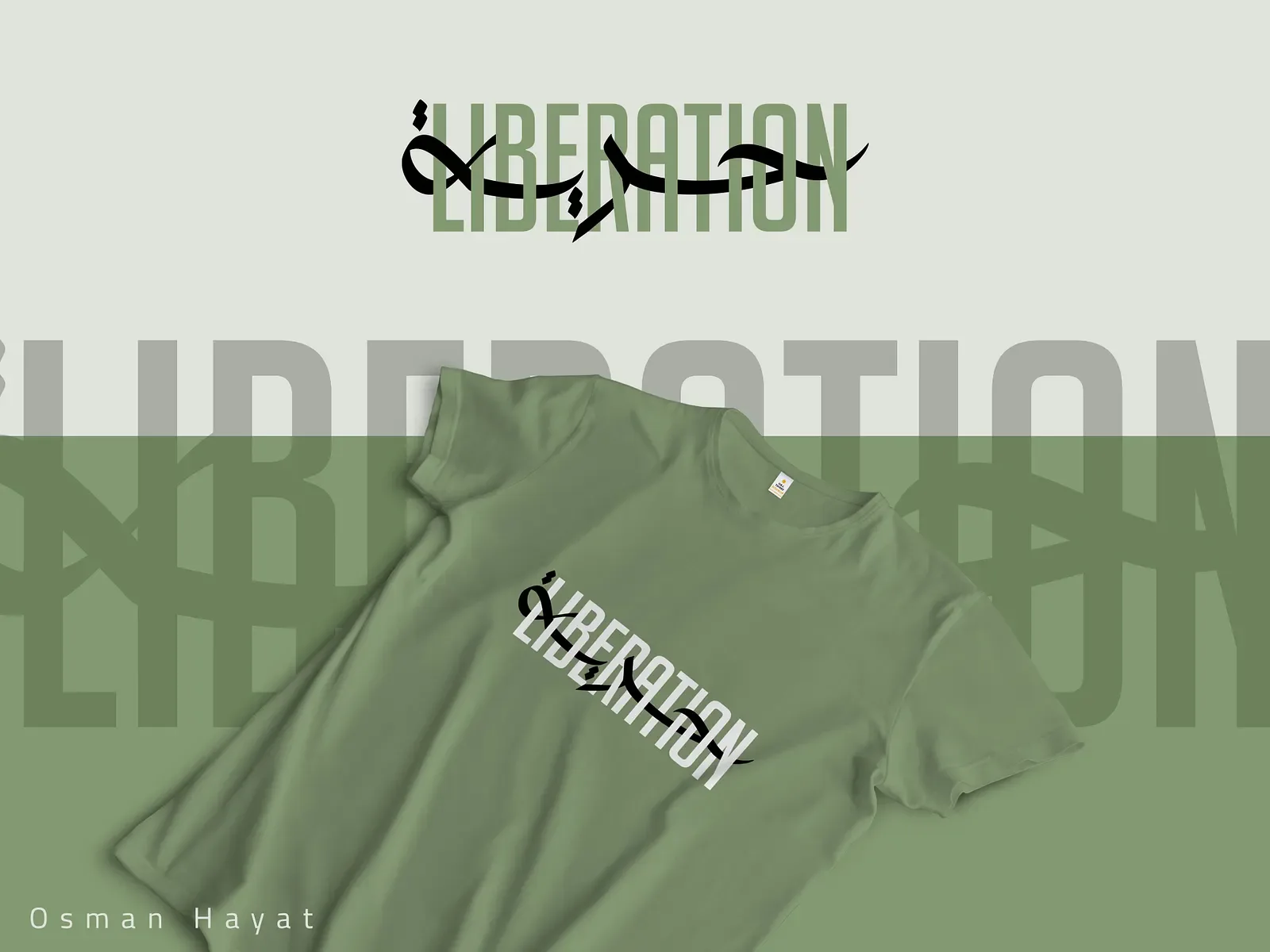
- Custom lettering — wordmarks and display cuts
Maqam Type is a Beirut-based foundry drawing contemporary Arabic typefaces built for screens and interfaces, not just print. The practice grew out of a simple frustration: most Arabic type available to product teams was drawn for headlines and posters, then forced into UI contexts it was never built to survive — kashida stretching unpredictably in a button, diacritics clipping in a text field. Maqam draws from the letter outward, testing every release against real interface density before it ships.
Practice
Each family starts as a calligraphic study — the foundry keeps a working archive of Kufic, Naskh, and Ruq'ah forms — before it's rebuilt as a variable font with Latin companions drawn in-house rather than licensed in. Weight axes are tuned for screen rendering at small sizes first; display cuts come after the text weights are solid, not before. Every release ships with an interface-testing kit: real buttons, real form fields, real navigation bars, so a client can see the face doing the job it was drawn for.
Commissions
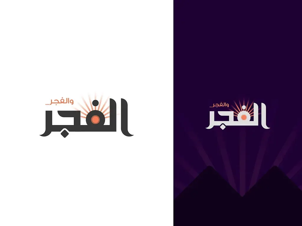
Work has included a full type system for a Gulf banking app (11 weights, bilingual, still in production), a display face for a Beirut cultural festival's wayfinding and print, and an ongoing collaboration with a Cairo-based news platform rebuilding its reading typography for mobile. Maqam takes a small number of commissions a year, deliberately, to keep every family test-driven rather than drawn to a deadline.